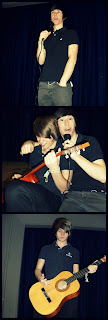
After spending hours editing each photo, adjusting the exposure/contrast/highlights and making specific colours stand out more than others, I have decided which images I will put in my magazine and where. Firstly, for the front cover I’m going to use the back to back image of Sam and Jake with guitars. I like this picture as they actually look like a band and although Jake is not paying attention, Sam is focusing directly on the reader. Both of them are posing as if it were an actual photo shoot! Then for the double page spread, I will create a college using Picnik, as I have used the photo editing site before and know how to use it very well, and it will contain three photos – individual ones of the boys and one of them together. And then on the other side of the double page spread I will have a big photo (taking up the whole page) of them both.
This is the one I will use for the front cover, the image could interest a female audience (not only male which is reflect by the colour schemes) as they colour be attracted to the band. After getting rid of the red eyes; airbrushing out any lumps or bumps and making them look flawless and professional; and adjusting the colours, I finally completed my first edit. I didn’t need to crop out the background as I stood them against a blank wall which was a creamy colour anyway and I wanted that as my background so I just used the brush tool and brushed around them making the colour even everywhere. I found it fun playing around with the different tools Photoshop provided. I like the edited version, but personally I found it made them look quiet dull and boring and if I that picture on the front cover I would think it looked to over edited and unprofessional. So, I decided to stick with the original image colour with no effect apart from touch ups as I thought this looks more genuine. I also considered the arrangement of the page, as the photo takes up the entire page there would be no room for other stories or captions or even the logo. So, I adjusted the size of them and made the background bigger and made space on the left hand side – sticking to the rule of left third – and made space for other bits but still had the boys as the main image, just moved to the side a bit. This will set my basis of my music magazine.
I recrearted the pose of this picture to the one of Alex Turner and Miles Kane. It represents a brotherly bond between the two stars and portrays their closeness.
As I grew more confident with Photoshop, I began to use different effects not just the adjusting of the colour has a whole image but highlighting certain aspects of the picture. For example, in the second photo I have highlighted Jakes hair making it blonder and stand out against the dull background. I have whitened their teeth and their eyes making the photo look more professional and perfect. I really like this photo and will defiantly include it in my magazine either on the contents page or on the double page spread. I liked the black and white image but when I ask for my friend’s opinion he said that ‘you don’t really see black and white images in magazines.’ So I undertook some research and investigated what pictures double pages spread used and he was right, the only time I found a black and white image in the magazine was when it was a tribute to Amy Winehouse as she had died and it would have been offensive to use bright colours to represent her death. Thus, I decided against the black and white photo.
I'm glad I researched the different poses (based on the photos of Alex Turner and Miles Kane) as I used the music artists are very iconic and inspired me to base my music magazine on an indie music sub genre.


No comments:
Post a Comment